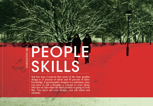
Okay, I’m rather confused right now. After the comment Maarten gave me on the last post, I started fooling around with some no-go fonts, as there are: comic sans, papyrus, impact, and last but not least, the most commonly used font ever: Times New Roman. And I actually like it in this design. Surely this is all but a dream, and I’ll wake up in a minute, and we’ll all have a good laugh about it. RIGHT?
PLEASE KILL ME.


The revolution has begun!
And no, it doesn’t look too bad like that, maybe you could just try a good serif-type?
also:
http://xkcd.com/590/